This a question that has yet to be answered. It is something that now I am considering how to present this work must be formalised in writing. The peripateticism of my approach to my work is significant. I literally, ‘go for a walk’ and see what I find. This takes quite a leap of faith but it also always serves to re-validate itself as a means of beginning a project, and in the same breathe, of demonstration of the resourcefulness and abundance that pervades the whole of life!
There are a number of things about Coventry that are of interest to me. The industrial revolution saw it as the centre of ribbon manufacturing and Alfred Herbert founded the Herbert Gallery and Museum on the wealth of his tool-making business. Historically it is the centre of transportation in the UK. The Asian population were economic migrants in the 1950s who were attracted to the automotive industry there. It is a place of transition, therefore. It was completely re-built in post-war modernist idealism and for all it’s failings (the predominance of concrete being one) the spirit of ‘PEACE AND RECONCILIATION’ that emerged from the disaster of WWII pervades the place.
Geologically it sits on the same type of bedrock as Stoke on Trent. It is also shaped like a bowl geologically. The ring road acts as a kind of safe rim to the city; you can never really get lost. Yes, the heart is a shopping centre, dominated by concrete but there is a municipal kindness and an overwhelming sense of unity in the place that sustains it. I realise from this response that I am acutely sensitive to the heart of a place and I find fragmentation very destructive. Perhaps this is the reason for my reaction to the Kings Cross development.
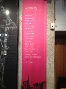
The Cathedral. It is full of art. Even it’s stained glass windows were a major commission for contemporary artists. It has an international reputation for unity that is lost on the national UK population and it manages a sense of intimacy in a vast space that I cannot help but contrast with the space of the new UAL building, which is itself a whole other type of cathedral!
Comparison over, the discovery of unity and strength of purpose in the place is supported by the people I found there. It touches me because they are open and honest about their work and honesty is something I value above nearly all things. As makers we hold the tools to forward motion, towards improvement and progress. Discovery of Coventry has been a very important one in the synthesis of my learning at this stage of the degree.
I need to speak to Uma about the regional density of family carers in Coventry compared to the rest of the country as it seems like a very densely packed region for carers (45 in the one group that I am working with alone). She will know where to look I am sure.